Whether ice-cream or a vessel of wine, typography is key.
There is relevance in ice-cream and wine. Ellen Lupton and Beatrice Ward both talk about typography, work-horse, hierarchy; one chooses dessert to talk about it, the other alcohol vessels! But what they say does all come into play when looking at editorial design. Choose something appropriate, something for the reader, something that fits the character. Don’t rely on Adobe autos, especially when it comes to justification!
I’ve done a fair bit of typesetting in other contexts, the Order of Service has been one of the main ones, but my university work and ongoing self-directed briefs (cookbook coming soon!) show my greatest creativity with typesetting and hierarchy. It’s also where I understood the subtleties of how type works in continuous text. For example, Baskerville has very tale capitals, almost garish, so Mrs Eaves can be a good alternative, although after using it over the years the x-height is a little short!
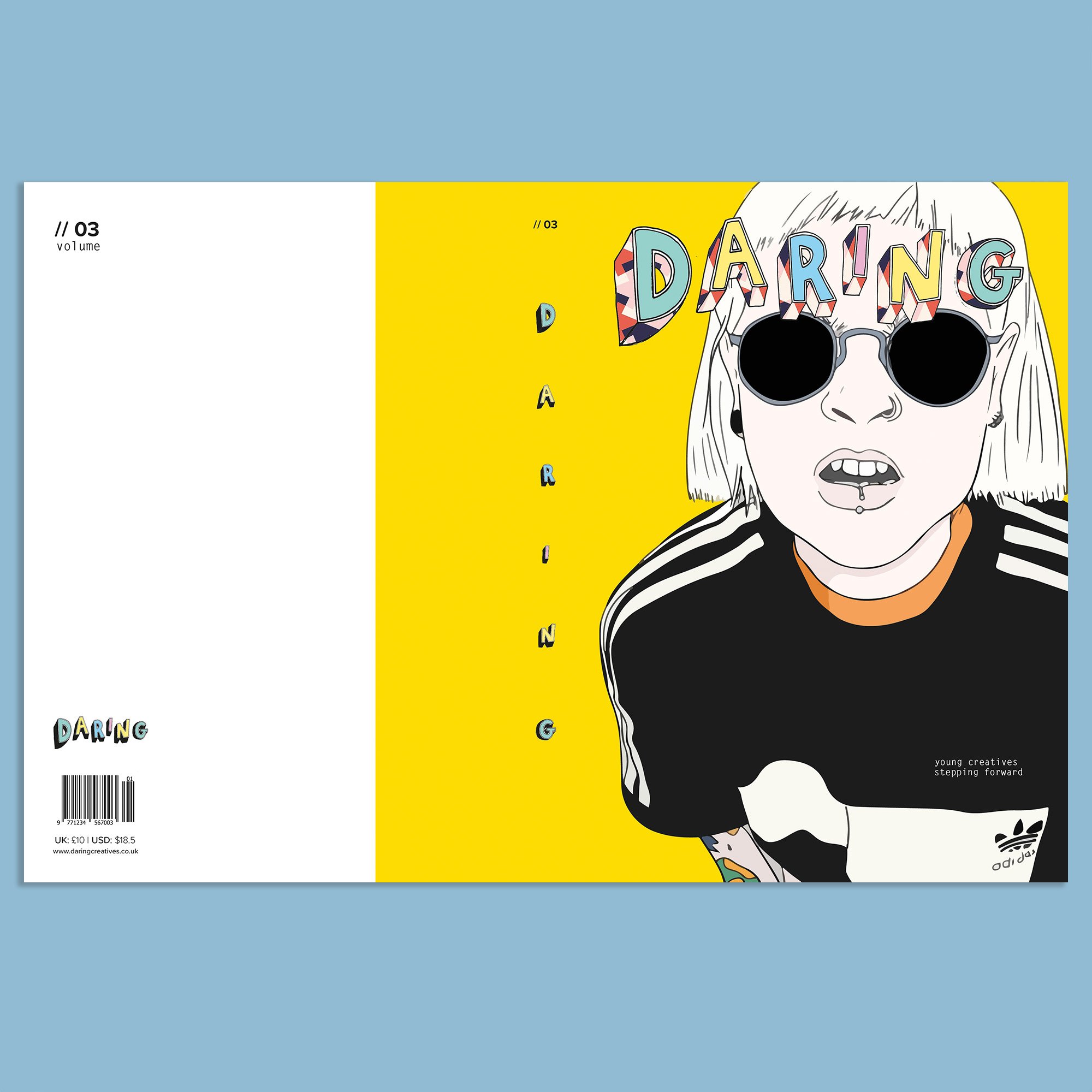
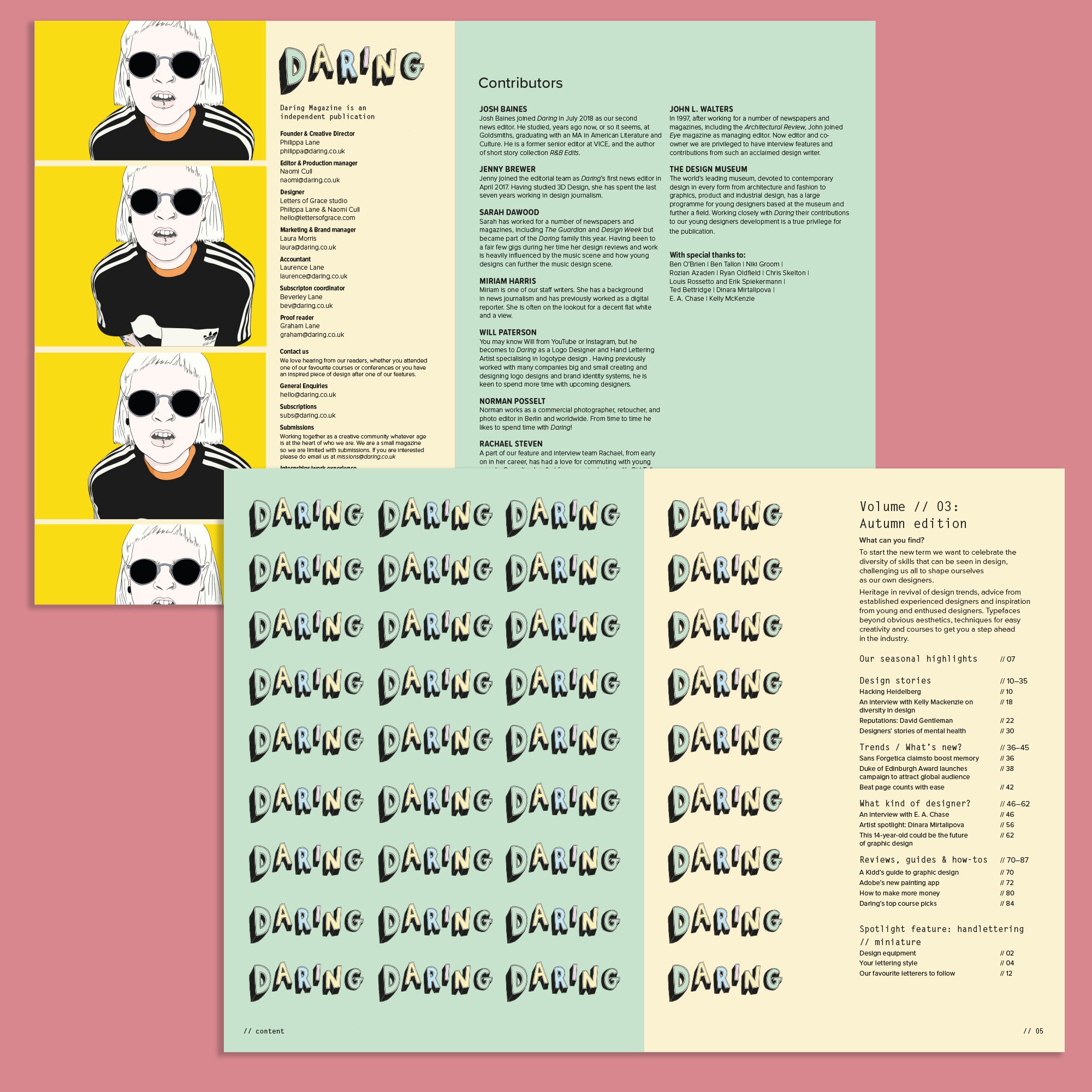
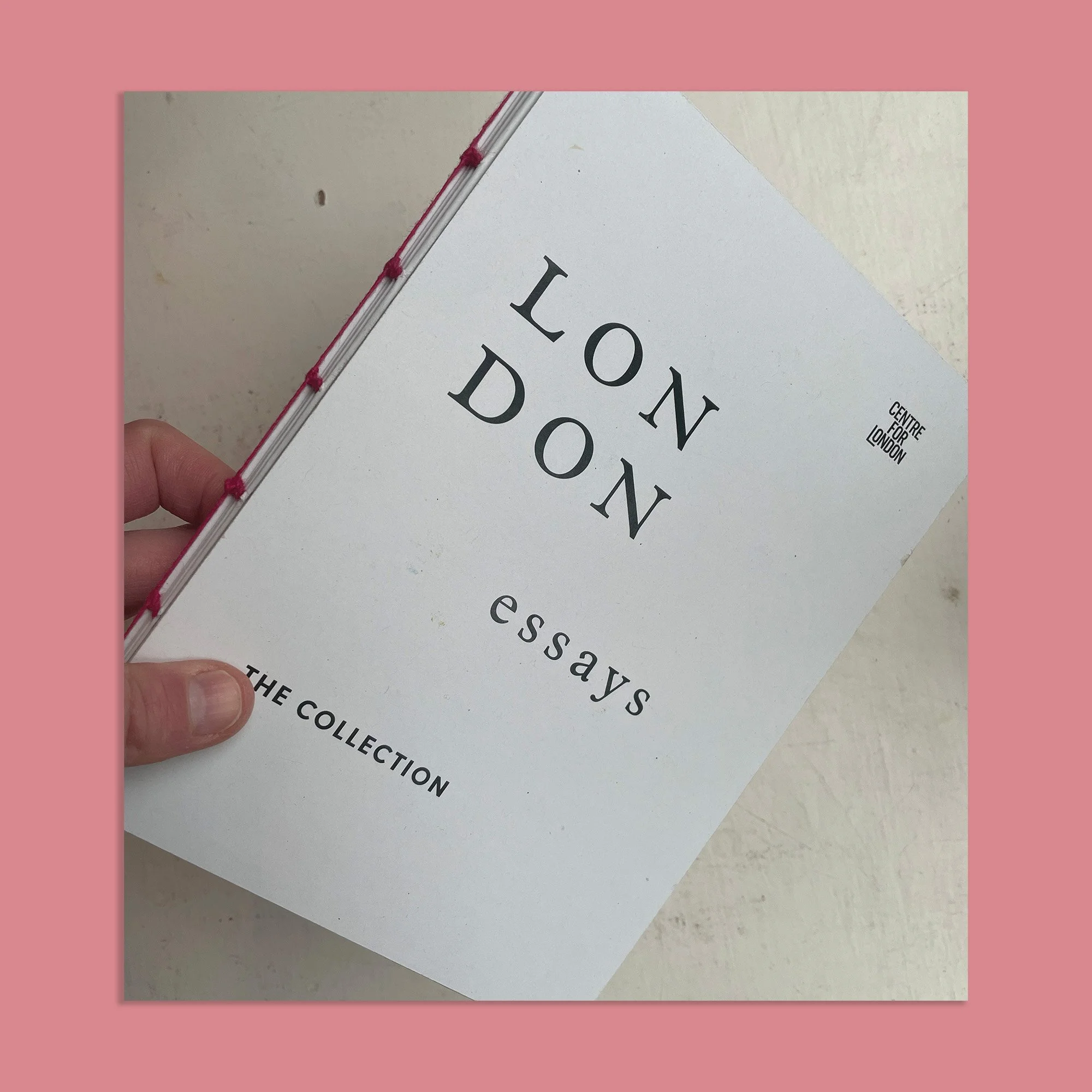
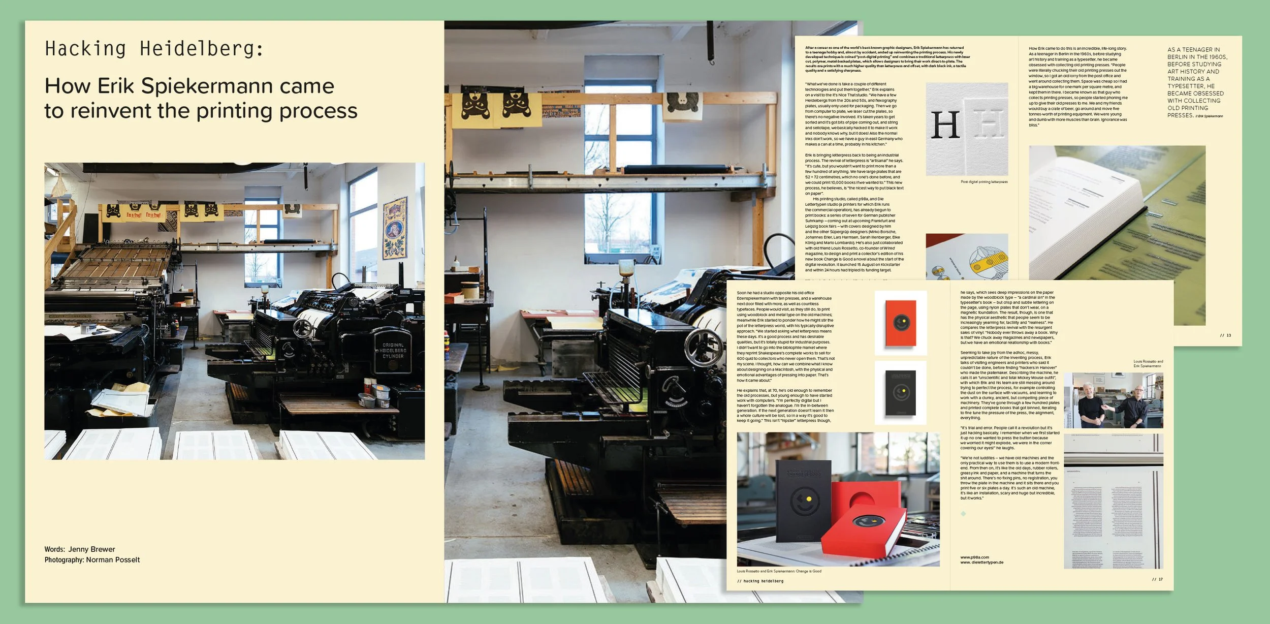
From colour and some signature handlettering to more formalised typesetting and, of course, the essential image and word relationship, here are some of my favourite editorial and book design project alongside a couple of spreads from my dissertation about book cover branding.
Skills
Typography
Editorial Design
Print
Branding
Role
Designer | Art Director
Year
09/09/2017–mid-2022


