For the
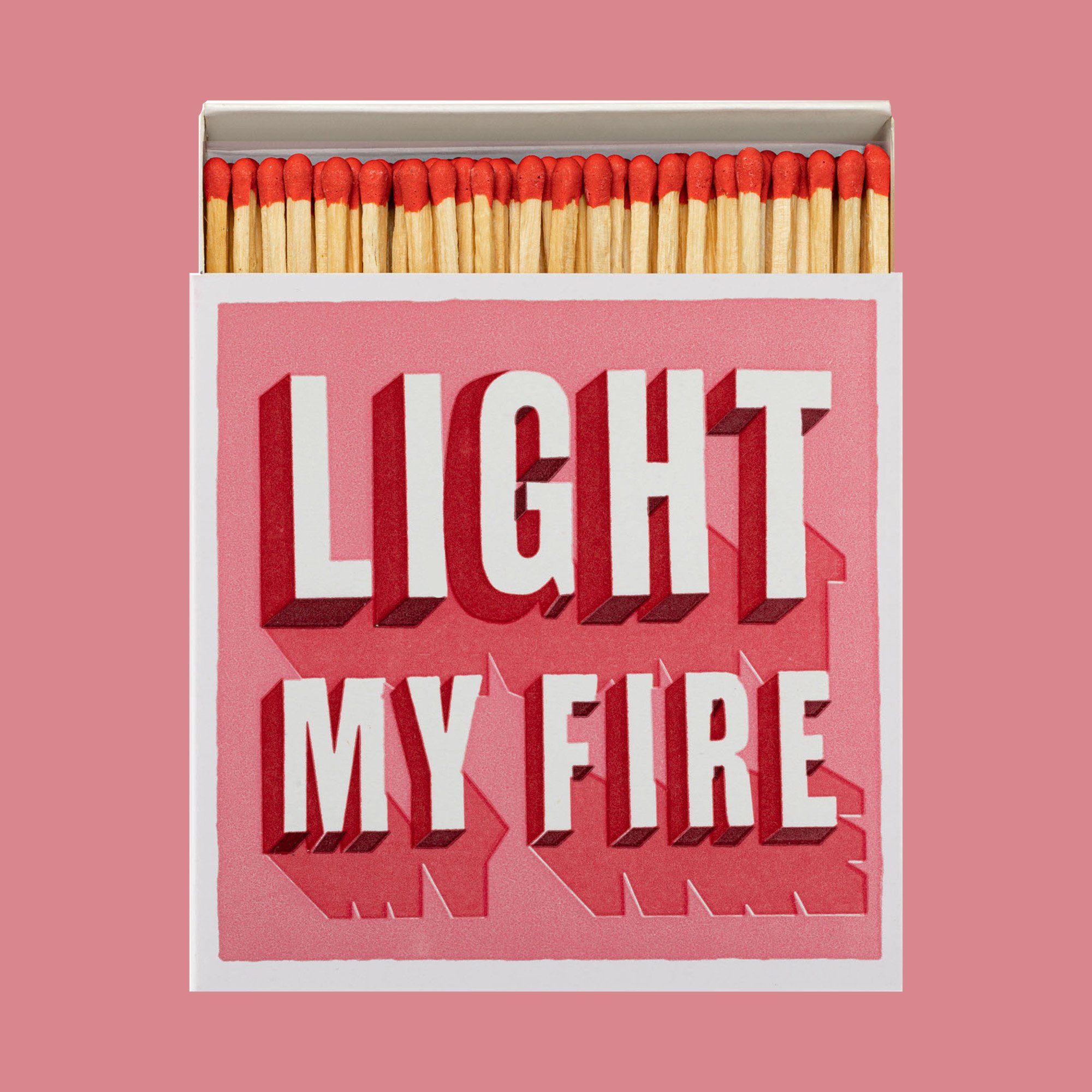
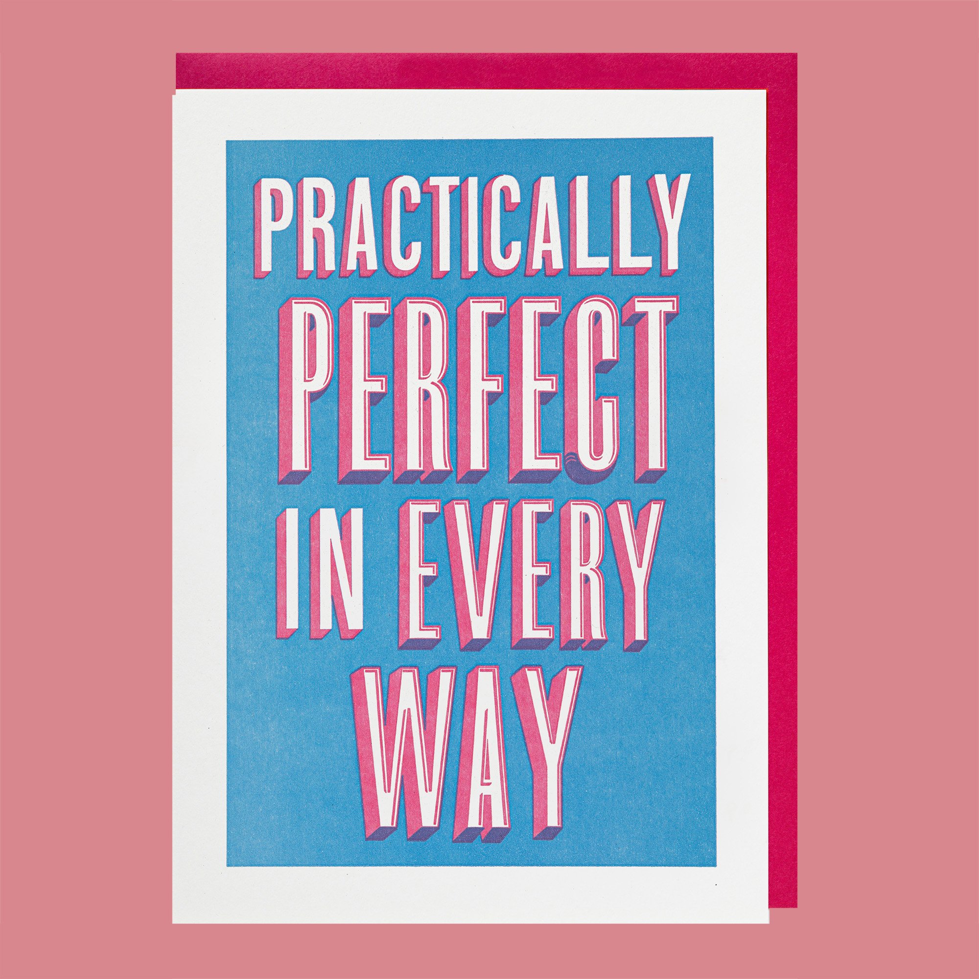
love of type
A collection of card and matchbox designs combining the playful and characterful nature of type with the heritage and sensitivity to the art of letterpress. Hand-drawn and vector type design, working from concept to letterpress plate layered artwork. Printed on a platen press with pantones selected by me. Final designs use a mixture of gold foil and ink, a maximum of five colours used.
Reversing out, overprinting for more colour. It can be easy to miss something. Can you spot the artwork error….?
Created and brought to market for Archivist under my role as Head of Design.
www.archivistgallery.com
Lifestyle photography by Sarah Frances Kelley.
Skills
Typography
Design
Print
Illustrator
Colour Selection
Art Direction & Marketing
Role
Designer | Art Director
Year
01/01/2024

Wood block type, printed on a Cylinder and scanned for vectorising.


Hand-drawn type based on tracing wood type.


